Homie Dombo!
It’s freezing here in Amsterdam and we’re flabberguested about it. It’s almost halfway March. So instead of sitting in the sun enjoying the start of spring, we’re kind of stocked inside the house.
So we thought let’s make things happy and warm.
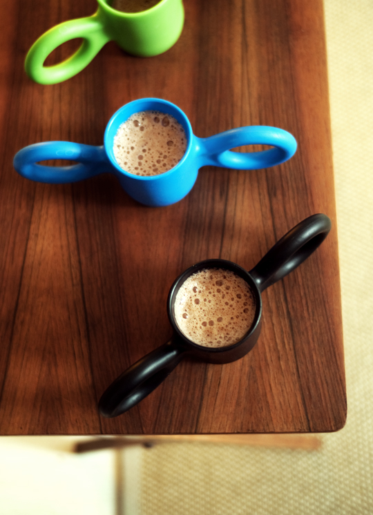
Luckily there’s our friend the Domoor-cup a.k.a. Dombo. He’s like a homie, hanging around with us. We know him for quite some time right now. Making us happy. Drinking hot cocoa today! Hoping he will never leave, haha!
Thanks to cool dutch designer, Richard Hutten, we’re living with this
very cool [ he’s making us smile ] Dombo!
 photography: waikikilab.com
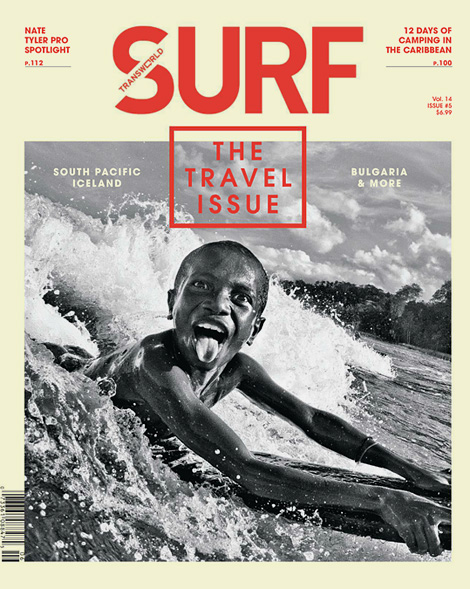
Best surf-mag-cover ever!
Do we need to say more? Through Pinterest we’ve found out about this cover of TransWorld SURF magazine ‘the travel issue’, launched last summer. A brilliant shot by, Bali based, Australian surf photographer Brad Masters.
This cool boy represents the feeling of surfing. The first moment you’re catching a wave! The feeling is awesome, fun and makes you totally happy. And you never want to get out of the water again. That’s what we’ve experienced ourselves and that’s what the photographer has perfectly captured and what this boy is showing us… The emotion. Really brilliant! A picture and cover we would love to have in our Amsterdam ‘aloha’ home, big time!
Photography: Brad Masters
King of the groms 2013!
To all the cool surfer boys under 16…,
this is your chance to RISE & SHINE
and become the king of the groms 2013!
The idea is to upload a video of you rippin’ the waves before June 30th. The voting will be online, so 100% digital.
On August 1st the 15 winners will be announced who will compete in the International Final during the Quiksilver Pro France 2013!
Be as wild and creative as you can and make yourself stand out! Good luck!
Check the cool video or more Quiksilver events on Quiksilver live.
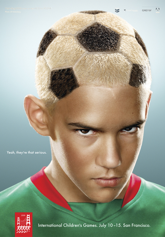
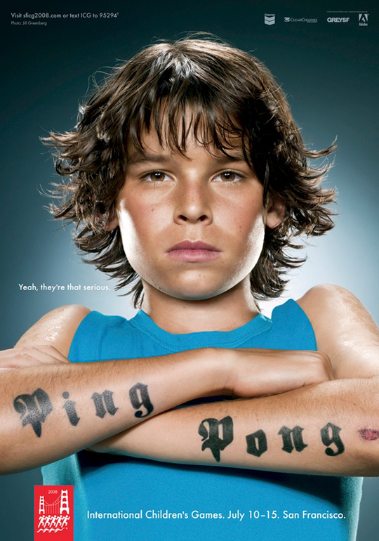
Very cool heads, by Jill Greenberg!
This morning was an exciting one for us. My oldest son was about to show his soccer skills at a talentday of the legendary Dutch club Ajax. That why I’m kind of focused on soccer style today… I guess…
This great ad was released in 2008. Cool boys photographed in a cool, tough and yet very creative way. It’s all about the details.
Created by Grey Agency from San Francisco for International Children’s Games 2008.
Photographed by Jill Greenberg. Famous of her crying kids and Monkey Portraits. Incredibly cool. We loved that already, so it’s no surprise this one caught my eye today!
So no launches or previews, just things that you know will stay cool forever anyway!
Visit ARTSY to see all her amazing work together!
Bouroullec boys rock!
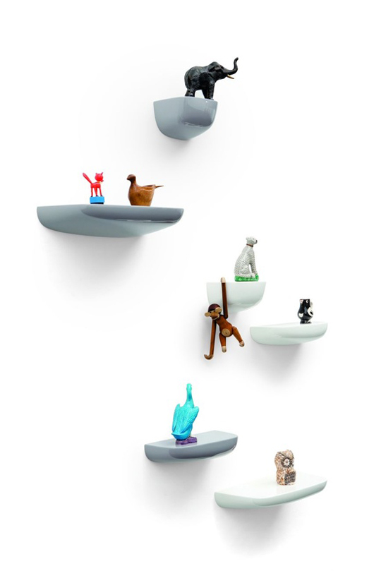
In 2012 these beautiful ‘rocks’ from the famous design brothers Bouroullec, Ronan and Erwan, were introduced in the collection of wonderful well-known design manufacturer VITRA.
The Corniches, are looking so beautiful and simple, but are yet sooooo inventive.
The idea arose from the need for small storage spaces to spontaneously keep items. Creating an impromptu storage in everyday life. There are three different shapes and the way you compose them makes it unique.
For us, the ideal way to make an exhibition at home with all our collected items…, new, secondhand/vintage, found at the streets, bought at fleamarkets or inherited. And change it easily every time you like.
These contemporary ‘rocks’ are forever!
And get the free the Corniches app too, it’s brilliant!
A ‘sneak preview’ modern fairytale by Noch Mini N.Y.C.!
In Paris I’ve met a wonderful ‘incredibly friendly’ designers couple from NYC with their brand Noch Mini. Designing beautiful contemporary organic childrens wear.
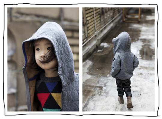
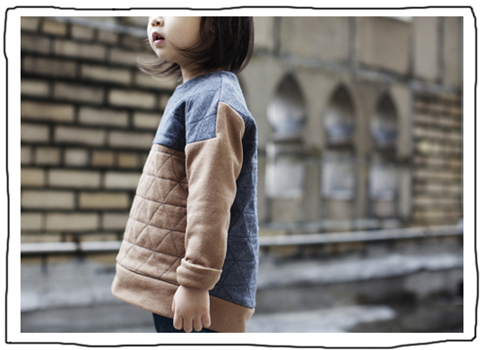
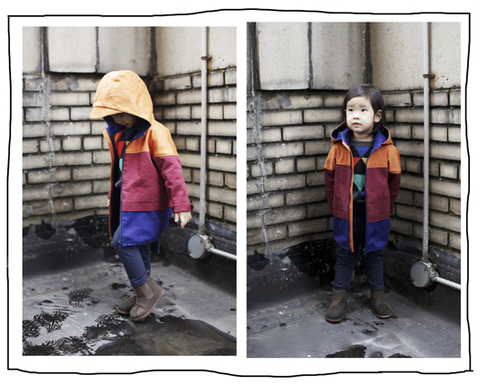
This FW13-collection feels like a modern fairytale to me…, in coloring, coolness and fabrics. At that time I couldn’t tell if it was for boys or girls. Which I think is brilliant and much more interesting for the modern parent.
The quality of the fabrics are so beautiful and rich. And the designs being 100% organic, makes it even better! Comfortable to wear for our kids, very stylish for the parents and really friendly for our planet, makes the brand getting more ‘coolheads-stars’.
The color and print inspiration of this collection came from Egon Schiele’s ‘Houses with laundry’ painting. Which I think is such a modern piece of art, a cityscape, painted almost 100 years ago.
Triangular motif from roof shape was part of their graphic and quilt pattern.
The Cool Heads are really happy to found this cool brand, which surprised us, as I keep repeating over and over again. And the pictures of photographer Emily J. Anderson plus the coolest girl (yes! yes!) in the pictures in combination with the great designs of her mum and dad (yes! yes!) makes it for me ‘this perfect modern NYC fairytale’.
We keep you posted about this brand and when it’s available online. You have to wait a little while though… First enjoying summer… But it’s worth waiting for!
Check their Facebook-page, to see much more of this collection. There is a shirt from which I think will be a big hit and all the -stylish-cool-heads-boys- want…! ; )
 photography: Emily J. Anderson
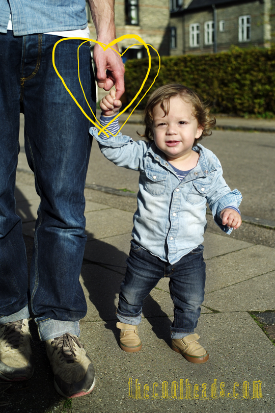
Little cool valentine!
Taking dad for a short walk through a street in Copenhagen, … holding on to his hand firm …, makes me ‘king of the world’! Thanks dad…, this ‘cool head’ LOVES YOU VERY VERY MUCH!
photography: waikikilab
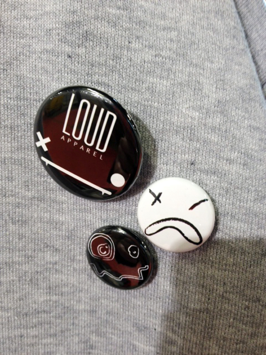
Sneak preview Loud Apparel AW 13
This time it’s really hard for me not to show the girls ‘sneak-preview AW 13’ too! Because it’s sooo stylish!
But I have to stick with the boys … : )
Very minimalistic at first sight. But it’s all in fine details. Boy oh boy… That’s why I like it so much. It’s more fashion in a Margiela and Comme Des Garcons way.
Monochrome colours, very strong minimal prints, geometrical details and LOUD APPAREL‘s signature leather pieces. Stylish and comfortable.
The best combination of London’s creativity and Italian craftsmanship: Owner and designer Serena is Italian and living and designing in London. That must be the secret of this cool brand.
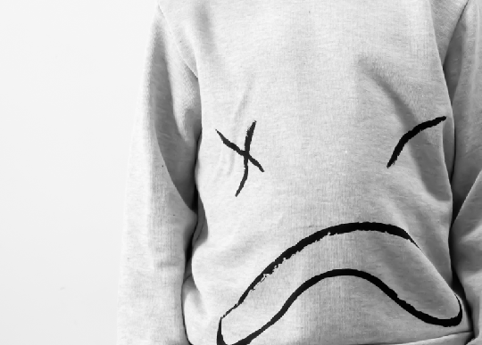
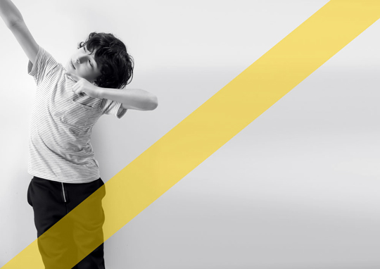
My oldest, mr. J., is already waiting for this cool sweatshirt – grey version with the graphic face -, in black!
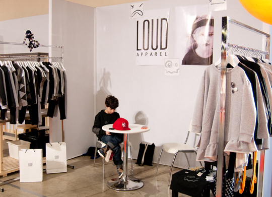
p.s. Thanks to Serena’s cool son, who was sitting and waiting at Playtime …wearing this new collection, it caught my eye!
Layered coolness by mr. Haroshi
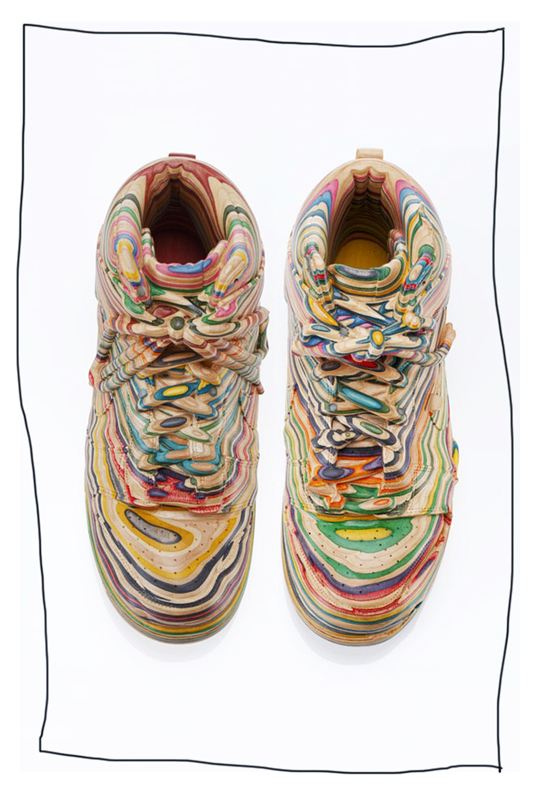
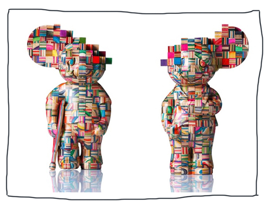
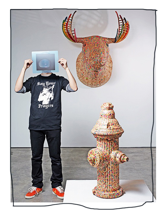
Made of old skateboards, this is ultimate recycling! These are really impressive artworks!
If you know how many layers a skateboard-deck has and realise that it’s not just a flat piece of wood and see these incredibly detailed sculptures… then you know how many hours/days/weeks/months he must work on this.
Mr. Haroshi ‘s work is so pure and dedicated. His experience and almost crazy knowledge is necessary to make this kind of art. He’s able to differentiate from thousands of used decks… by lines, shapes, colors and every other detail… before being able to make a real piece of art, like the one we love most because we wear them, the Nike High Dunk.
We’re happily flabberguested! Thanks for this inspiring work mister Cool Haroshi!
The glasses are a nice example for applied design from Haroshi…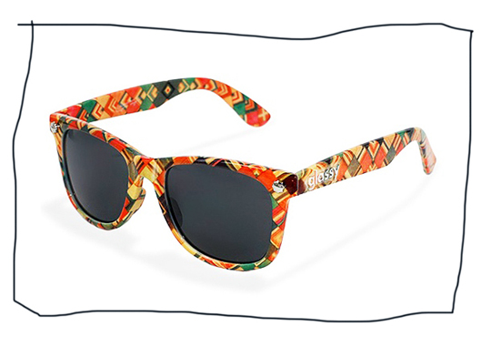
Photos art:
taro hirano
Pictureman Studio
Portrait Haroshi:
Adam Wallacavage
framed by the cool heads
Copyright © All right reserved.
Haroshi.com
Mister J’s rock ‘n roll sunday!
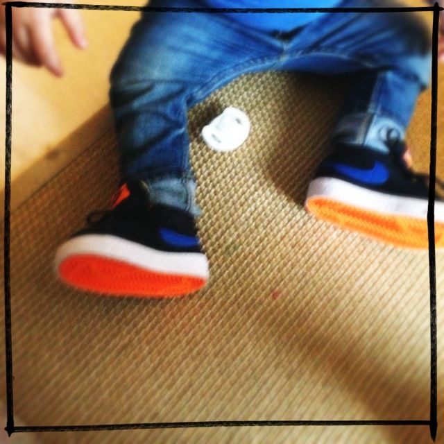
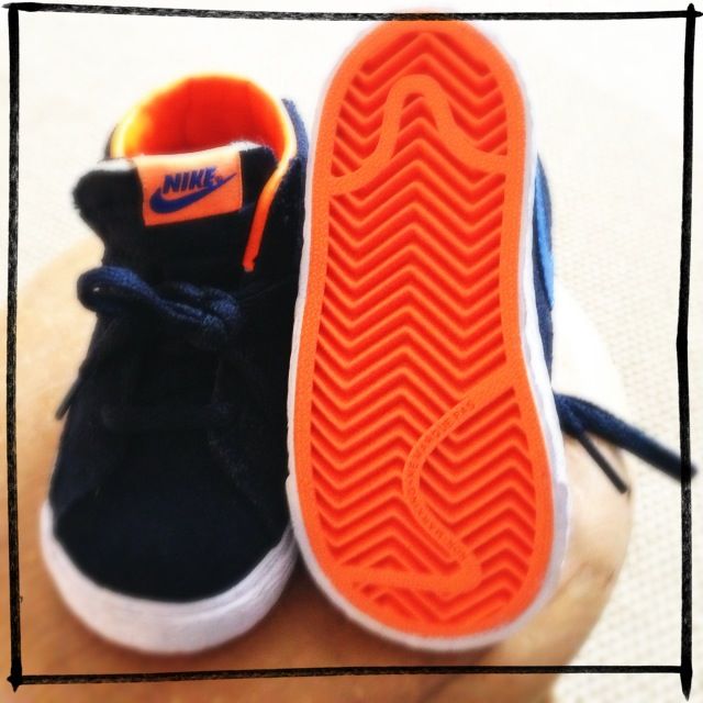
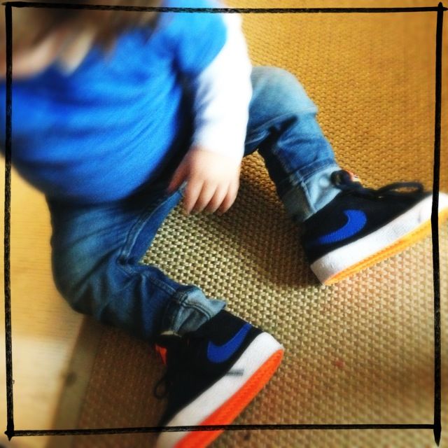
Today is Rock’n roll sunday! Going to a party of a good friend… In old H&M skinny blue denim, American Apparel T and Nike Blazer Mid Vintage
HAPPY SUNDAY!

